Thursday, September 3, 2015

After a long summer... Poster for the 20th Art Exhibition in Crozet

Après un long été... Affiche pour la 20 ème exposition d'arts à Crozet

This summer has been a busy one for me, but it is only now that the various things I've been working on will start being public, and so it becomes the time for me to share them with you. Back in June, I worked in this poster for the 20th Art Exhibition in Crozet, an exhibition of arts and crafts by local artists, which will take place this October, in my little town, and in which I will also show some of my work.

During the exhibition, a contest among the participating artists takes place. This year's contest is themed about "voyages", and so this is what the poster is about, voyages from the perspective of the artist who goes everywhere with his pencils, paint box and sketch book, and captures everything that will inspire him.

Sometimes, when time allows it, I can myself be this artist, and so I could use some of the drawings I've made in the past, but I also did others specially for this occasion, and mixed papers with different textures to make the final effect. And yes, in case you're wondering, that aquarelle box in the bottom, yes, that one, is mine :)


Poster for the 20th Art Exhibition in Crozet, 2015


Cet été a été très occupée pour moi, mais il est seulement maintenant que les différents projects que j'ai réalisé commencent à être publiques, et il devient le temps pour moi de les partager avec vous. Au mois de juin, je travaillais dans cette affiche pour la 20ème exposition d'art à Crozet, une exposition d'art et d'artisanat par des artistes locaux, qui aura lieu en Octobre, dans ma petite ville, et dans laquelle je vais aussi montrer quelques de mes travaux .

Lors de l'exposition, un concours entre les artistes participant aura lieu. Le concours de cette année est sur le thème "voyage", alors c'est aussi le thème pour l'affiche, voyages sur le point de vue de l'artiste qui va partout avec ses crayons, boîte de peintures et son cahier, et capture tout ce qui va lui inspirer.

Parfois, quand j'ai le temps, je peux être moi-même cet artiste, et alors j'ai utilisé quelques dessins que j'avait déjà fait, et je n'ai fait aussi d'autres spécialement pour cette occasion. Après j'ai combiné des papiers avec des textures différentes pour rendre le effet final. Et oui, au cas que vous vous posez la question, cette boîte à aquarelles tout en bas, oui, celui-là, est la mienne :)

Monday, June 22, 2015

Children's card design and illustration

Recently I came back to my pencil colors to draw illustrations for a card for a child's baptism. It was nice, after what it felt to me like a long time, to color things again with pencils. Painting takes much longer than with watercolors for example, as it is by mixing many soft layers of different colors, drawn with different inclinations, that I have the effects I desire. But it is very relaxing, and it surely does test my patience :) 

Usually I don't think about taking pictures while I work, but this time, as I wanted to show the progress to the person who ordered the card, I didn't forget of doing it, and I can show here the work progress. In this work, the drawing is simple, because is the colors who give the whole magic. Although of course having drawn the right theme is always important!

The card is to be squared, 14 x 14 cm, so I made the drawing proportionally, but a bit larger to gain resolution in small details.


First drawing for the front cover, ready to paint


Coloring progress. I started from the left bottom part until I finished all the mountains and trees. Then I did the sun and the sky. Finally, the sea in the middle, the stork, and the baby throwing up the stars in the sky.

Front cover drawing finished.


Detail of the drawing in the back cover, for which I followed the same process as with the front cover. But it was much faster! :)


Finished card. It folds in the middle, so that the main drawing is in the cover, and the small one in the back.


Picture of the finished card, courtesy of the client.

Friday, May 29, 2015

Illustration Contests 

Concours d'Illustration
Concursos de Illustración

Sometimes, when there is time between project and project, but not time enough to make significant progress in other longer term ones, I participate in illustrations or poster contests. Wining a contest is a bit like winning the lottery, so I have learnt to take defeat OK, and be happy if I was happy with what I presented. The illustration below is one I made for an international illustration contest held in Torino, Italy. I didn't win, but I am happy to share it now. I hope you like it!

Full illustration (shape given by the organisers)


Fragment of the above illustration


Parfois, quand il y a du temps entre projet et projet, mais pas du temps suffisante pour des projets plus longs, je fais des illustrations et des affiches pour des concours. Gagner un concours est similaire à gagner au loto, donc j'ai appris à pas m'attrister si je ne gagne pas, mais être contente si je l'étais avec mon travail. La illustration au-dessus c'est une que j'avais presenté pour un concours international d'illustration à Torino, en Italie. Je n'ai pas gagné, mais je suis contente de la partager avec vous. J'espère que vous vais l'aimer!

A veces, cuando hay tiempo entre proyecto y proyecto, pero no tiempo suficiente para proyectos más largos, hago ilustraciones y pósters para concursos. Ganar un concurso es casi como que te toque la lotería, así que aprendí a no entristecerme si no gano, y a estar contenta si estoy satisfecha con mi trabajo. La ilustración de arriba es una que presenté a un concurso internacional de illustración en Torino, Italia. No gané, pero estoy contenta de compartirla con vosotros. Espero que os guste!


Thursday, May 28, 2015

The Burkels, family scene portrait

Les Burkels, portrait d'une scène familal

This one is a detail of an illustration I made on command, to be given as a birthday present for the fathers' 40 year birthday. It is a picture of a family scene, and the daily chaos of having three young children, a dog, chickens, rabbits...


Publicity for the 88 edition of the Festival de Musiques du Pays de Gex

Publicité pour la 88ème édition du Festival de Musiques du Pays de Gex

Poster for the Festival, also used as a cover image for the booklet with the program...
Affiche du Festival, utilisée comme couverture pour le livret du programme...


... and flyers with the same theme 
... et flyers avec le même thème


Thursday, May 14, 2015

Exposition Atelier Académie de Ferney


If you are around the weekend from the 29th to the 31st of May, you can visit the annual exposition‬ of the Atelier Académie in Ferney-Voltaire. There will be drawings and sculptures from the last year modelling sessions from many local artists, including me. I will be there Sunday 31st, from 10 am to 12 pm. See the flyer below for details!


Si vous êtes à la région pour le weekend du 29 au 31 de mai, visitez l'exposition annuelle de l'Atelier Académie de Ferney-Voltaire. Il y aura des dessins et modelages faites par des artistes locales, moi aussi. Je serais là dimanche 31 mai, de 10h à 12h du matin. Le flyer dessus a tous les détails!


Affiche réalisé par Annette Unser avec dessins et sculpture d'Annette et Sabine Unser


Sunday, April 19, 2015

Poster for a concert

Affiche pour un concert

Póster para un concierto


Poster I recently made for a concert this coming May. Maybe it will make you feel the warmth of May evenings...

Affiche que j'ai récemment fait pour un concert le prochain mois de mai. Peut-être vous pourrez sentir la douceur des soirées du mai...


Póster que hice recientemente para un concierto el próximo mes de mayo. Quizá os hará sentir la tibieza de las tardes de mayo...


Monday, March 30, 2015

Publicity for a kindergarten
Publicité pour garde des enfants
Publicidad para jardín de infancia
Flyer and webpage header for a kindergarten. Not a kindergarten in the traditional sense, but a house kindergarten. This is something very stablished at least in France, where the "maman de jour" are recognised by law, but in Spain is just starting now, and hence, not very well known by many. The flyer is printed A6, two sides, one in Catalan and one in Spanish, both with the same design.

Brochure et bande en-tête pour le site à internet d'une maman de jour à Barcelonne. Les mamans de jour sont bien connues en France, mais en Espagne, il faut encore expliquer!
Le brochure est imprimé en taille A6, par deux côtés, un côté en espagnol et l'autre en catalan.

Folleto y cabecera de sitio web para una mamá de día, es decir, un "jardín de infancia en casa". El folleto se imprime en A6, por las dos caras, una en español y la otra en catalán.


Flyer for a house kindergarten. Printed A6, double side, one Catalan, one Spanish.


The same design is adapted for the site's header. If you look at their pictures, you will see why there's an hammock in the design.

Le même dessin est adapté pour la bande en-tête du site à internet. Si vous voyez leurs photos, vous comprendriez pour quoi ils sont tous à l'hamac.

El mismo diseño adaptado para la cabecera de su página web. Si echáis un vistazo a las fotos, comprenderéis por qué hay una hamaca.


Website header.


Wednesday, March 11, 2015

Sketching Torino


A good friend invited me to Torino, and while she was working, I walked around and drawn. Yes, I really felt, for the first time, like a bohemian artist, travelling just to draw and paint!! The truth is that my daily life it is not at all like this, but it was very good to try it, at least once!

This is what I could gasp from Torino in few hours:


The big building is La Mole Antonelliana, the business man and the old man were having a coffee in La Piazza San Carlo, just as I was doing. The two ladies were sitting in a bank enjoying the sun, while I was having a sandwich lunch, two banks next to theirs, in Piazza Cavour, a beautiful square with a red church, drawn in the upper left corner. 

Next time, I hope the Egyptian museum will be open, that promises to be very exciting!


Wednesday, February 25, 2015

Drawing in Crozet


Today it was a beautiful day, almost end of February, sunny, and I saw the first bee announcing that (hopefully!) Spring is coming! This is a view of the Rue du Jura in my little village, Crozet.


Later in the day I've learned that the man in the bike lives also in the same road, but a little bit upwards, and that he goes up with his bike every morning. And every morning his neighbour comes out and they talk for a while. I am very happy that I could catch a small piece of the daily routine in my little village, and that I got to know a bit more of the people living there. When I go out to draw, what I want is to capture a scene, and it is only sometimes that I get to learn what is behind what I drew.

Tuesday, February 17, 2015


Poster for a scientific conference


This is one of the jobs I've been lately doing and that now is public in 
http://forum2015.nikhef.nl, a poster for a conference on mechanics engineering on particle tracking detectors, called simply "trackers" in scientific jargon. 


Behind every poster, design or illustration there is always some research, and a lot of thinking and brainstorming with yourself. 
What is that image that you are looking for that will represent the whole idea in an attractive way? 

Sometimes ideas come easier than others, it depends a lot on the topic and in your experience. If you are familiar with it, it may help, if the topic is very popular it can be trickier to find something original. In this case, I can say my previous life as a physicist helped quite a bit.

This was my first drawing for this poster:


Do you see what it is? 
Clue: How is the design related with the conference topic and place?

Can you guess where the conference is taking place? 
Why are these buildings placed in a circle? 
Why are there bridges? 
What is this circle divided like a cheese in the middle?


There is nothing random in the design, and every element has a reason to be there:


First thing to think about: what is a tracker? How does it look like?

Trackers are designed by physicists and engineers. Usually, the former think about what is needed in terms of the physics they want to measure, while the latter design and maintain services that are essential for the experiment.

Trackers can have different geometries depending on the physics targeted by the experiment, but in general, if one is interested in collecting as much information as possible, they are cylindrical to cover all possible physical space (see here). They are usually immersed in a magnetic field, and measure properties of charged particles. And they are called "trackers" because charged particles do actually leave tracks on them.


Second thing to think about: what is different about this conference edition?

Scientific conferences have usually many editions that take place once in a year, or once in every two years, depending on the conference. Normally, each edition is organised by a different scientific institution, and so it changes venue every time. 


Can you answer now all the questions above?

In this poster, I have used a very distinctive and recognisable feature of the conference location, Amsterdam. Its beautiful buildings and canals are known and admired by everyone (counting myself in!). 
I painted some typical houses in a circle, emulating a frontal view of a tracker detector, made the "cheese" to mark the geometrical center of the detector where the tracks of the particles come from, and placed the bridges in the front to relate the city architecture and canals with the water of the Amsterdam canals, which actually represent the tracks of the outgoing particles. 


Indeed during this conference Amsterdam will become the center of tracking detector mechanics, won't it?


Sunday, January 25, 2015

Posters that become T-Shirts


Posters qui deviennent T-Shirts
Posters que se convierten en camisetas


T-Shirt from a design that I originally made as a contribution to the 2014 PosterForTomorrow poster competition to defend the right to work and the right to work right (poster entry here).

Think about it, what would it mean for you losing your job? Or without thinking about the most dramatic cases, what would it mean for you losing your enthusiasm about it? 


Tuesday, January 20, 2015

What is there behind the drawing in your T-shirt?


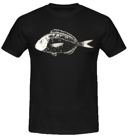
I recently made a personalised t-shirt, for someone who loves fishing. He told me he wanted a fish, and the fish he wanted, a gilt-head bream fish. We discussed a bit his ideas, and agreed on a basis for the design style, which for an optimal result would also drive the color of the t-shirt. In this entry I will show the whole process, and the final result which I am very happy about.

The gilt-head bream fish is one of the most tasty Mediterranian fishes. In latin, its name is Sparus aurata, where "aurata" refers to the golden bar between its eyes. Ok, this is all I know about it, besides that it is indeed very good! Wikipedia will probably tell you more, so I will talk about the design part.

The idea for the T-shirt was that the details and the characteristics of the fish were visible, and at the same time, that the design was simple enough to be easily printable. 

The first step is of course to draw it, for which I used ink, as it allows to draw details using clean and simple traits, and it is easily transferrable to the computer.


Hand-drawn gilt-head bream fish


The second step is to make it printable in a T-shirt, and create the whole design. An idea that came when working on it: actually one could draw the fish in the front, and the bones in the back of the T-shirt, so when people sees you coming sees the whole fish, but when they see you going away they only see the bones, the head and the tail, as if you'd eaten it. So I went back to the drawing board and drew the bones.
Hand-drawn bones


Then I scanned everything and started the design process. What happens when you scan something? You have pixels, the white background of the paper, or the white background of the scan machine itself. But you do not want the white square of your paper or your scanner to appear in your T-shirt, so some treatment is required before printing. In this case, I chose to vectorise the image, to be able to work on its elements separately. This is an option you don't always have, and has to be done with care, but here it worked out quite nicely. So I removed the background, and I worked on the image to remove some of the white filling in the fish body and fins to give them an "unfinished" appearance that would suit for a T-shirt, and at the same time, highlight the fish head and tail. While preparing the image, I added a black background to easily see all of its elements, and make sure no unwanted white areas from the paper background remained.


Front side fish as it will go in the T-shirt 


For the back side I followed a similar process. When all background was gone I merged it with the head and the tail from the front side, to give the fish the appearance it would have after it has been eaten.


Back side fish as it will go in the T-shirt


The final images must be background free, and the only additional color will be given by the T-shirt color. In this case, the person who ordered it wanted it in black... and here is the final result! 

                             
T-shirt in black, front side


T-shirt in black,  back side


There are many ways of designing T-shirts, most of the times one starts directly with the computer with vector images and the process becomes different. It also depends on the clothing one wants to use, and of course (and very importantly), on the final printing process. But this would be another entry...

Thursday, January 8, 2015

Je suis Charlie... nous sommes Charlie


Monday, January 5, 2015

Music Posters


A couple of posters I recently made to advertise two upcoming events in Thoiry. The first poster is to announce a concert, the second one to announce a Masterclass. The two posters have a total different finality and hence they have been conceived with very different styles. 


Poster Concert Echo du Reculet Fev. 2015


The design of a poster for a concert will of course depend on the nature of the concert itself. In this case, the music will be quite varied, so the poster does not evoque a specific style. The poster features most of the elements of the harmony who will play the 1st part, as well as the four flutists that will play the 2nd part, displayed in the circle that drives the whole design. The background color is black, and it is the magenta featuring the music floating in the background (in the atmosphere) which gives some warmth to the design (does music warm us up in a winter day? I'd say yes!). 


Poster MasterClass for flutes Fev. 2015


This poster belongs to the Masterclass series initiated already last year (see this entry), and so it keeps a similar style, with some specific changes for the occasion. Aside from the picture featuring the new musicians, colors are warmer, and the background displays a landscape made of staves, so that the lights and shadows from the musicians picture seem to come from the drawing behind, don't they?

Thursday, January 1, 2015

Happy 2015 ! 

Happy 2015 from the ATLAS experiment at CERN, with a card I did for the ATLAS Outreach & Education group. The card uses the official typo and color palette of the collaboration. The physics from the experiment is integrated all over the illustration. The card was printed in A5 format to be given to ATLAS members and at CERN, and is being posted in the social media to wish everyone a Happy 2015!

https://www.facebook.com/ATLASexperiment/photos/a.239880036049433.51122.235921729778597/807125785991519/?type=1&theater


Some details about the various elements in the card:
  • The Higgs very elegantly dressed wishes everyone a "happy 2015". It wears a smoking for the occasion, and it's holding a cup of champagne while toasting for the new year, with lots of bubbles coming out of it, like the many particles that have been detected, and will be, through 2015.
  • Behind the Higgs there's the ATLAS detector, half-hidden in mountains made of histograms (the representation of the data distributions in some given parameter like energy, mass, etc), which represent the Jura and the mountains that surround CERN, as well as the amounts of data the LHC has delivered to the experiments. 
  • On top of the last mountain (histogram) there's the data, following very well the physicists expectations in the left side, but showing an excess (new physics? a discovery?) in the right side. Because this is what physicists wish for the next run, and the next year.
  • The New Year and time for celebration is represented by the many fireworks up in the sky, all made of ATLAS event displays, with the tracks of the fireworks pointing all to the collision point in the center of the detector.

Wednesday, December 24, 2014

Merry Christmas, and Happy New Year!


Monday, December 22, 2014

Urban Sketching in Divonne Les Bains


So nice to go and draw outside after quite few computing work! Yesterday I went to the market in Divonne. It was a beautiful day, not so cold, and so sunny. We walked through the market and ended up in La Place des trois fontaines. While kids where playing, I took a moment to draw. What you can see is a corner of La Place des trois fontaines in Divonne, with a view of the Avenue de Genève at the right.

Très beau de dessiner dehors après des heures du travail sur l'ordinateur! Hier je suis allée au marché de Divonne. C'était une très belle journée, pas très froide, et avec un soleil merveilleux. Nous nous sommes promené par tout le marché, et après nous sommes allées à la Place des trois fontaines. Pendant que les enfants jouaient, j'ai pris un petit moment pour dessiner. Ce que vous voyez c'est un coin de la place, avec la vue de l'Avenue de Genève à droite.

Fantástico salir y dibujar un rato después del trabajo en el ordenador! Ayer fui al mercado de Divonne. Era un día precioso, nada frío, y con un sol maravilloso que parecía el sol mediterráneo. Paseamos por todo el mercado y terminamos en la Place des trois fontaines. Mientras los chicos jugaban, yo me tomé un pequeño momento para dibujar. Lo que podéis ver es un rincón de la plaza, y la vista de la Avenue de Genève a la derecha.


Friday, December 19, 2014

Social posters

A social poster is one with a social message. Through images, social posters can be used to denounce injustice, something abusive, or to celebrate some achievement. The final goal is to make people think about something in particular, and if possible, react about it.

One of the most critical things in our society now is the lack of job for many individuals. Lots of people loose their jobs for a very long time, starting a chain that ends up with the collapse of their lives and themselves. Someone loses his job, then cannot pay the bills, cannot pay the house, cannot pay his food, and eventually becomes alienated from the society, and from himself. Others have jobs that are very little rewarded, and also collapse, in a different way. So our job is that foot that we cannot loose, like in the image below.


See it in http://www.posterfortomorrow.org/en/gallery/view/38113
Personalised birthday cards

Cartes d'anniversaire personnalisées
Tarjetas de cumpleaños personalizadas


Birthday cards with animals, for kids! Here, with elephants.
Cartes d'anniversaire avec des animaux, pour enfants! Ici, avec des éléphants.
Tarjetas de cumpleaños con animales, para niños! Aquí, con elefantes.


Approx. size A6


Sometimes it is good to be original!
Personalised birthday card, in this example with picture, for a very special occasion.

Parfois c'est cool d'être original!
Carte d'anniversaire personnalisée, ici avec une photo, pour une occasion très spéciale.

A veces hay que ser original!
Tarjeta de cumpleaños personalizada, en este ejemplo con foto, para una ocasión muy especial!


Card cover (back and front), folded size A6, total size A5


 Card interior, folded size A6

Wednesday, December 3, 2014

Note de presse

Press article

Nota de prensa

Note de presse sur Le Dauphiné Libéré sur les travaux que j'ai fait pour l'Echo du Reculet!
(ici: http://imaginecarolinadeluca.blogspot.fr/2014/11/cartes-de-voeux-greeting-cards-tarjetas_28.html?spref=fb)
La version online peut être trouvée ici: http://www.ledauphine.com/ain/thoiry. Photo à continuation!

Date: 3 décembre 2014


Press article in La Dauphiné Libéré about the work I did for the Echo du Reculet! (here: http://imaginecarolinadeluca.blogspot.fr/2014/11/cartes-de-voeux-greeting-cards-tarjetas_28.html?spref=fb)
The online version can be found here: http://www.ledauphine.com/ain/thoiry, the printed article is just above (in French)

Nota de prensa en La Dauphiné Libéré sobre el trabajo que hice para la Echo du Reculet! (aquí: http://imaginecarolinadeluca.blogspot.fr/2014/11/cartes-de-voeux-greeting-cards-tarjetas_28.html?spref=fb)
La versión online puede encontrarse aquí: http://www.ledauphine.com/ain/thoiry, el artículo que se imprimió está justo arriba (en francés).